How Room 8 Group Upgraded Visual Identity: A Closer Look

The most popular articles
When you take the first step, it is often difficult to predict where this path will lead you in the end. Back in 2011, when we founded Room 8 Studio, the first brand within Room 8 Group focused on art production, it was impossible to predict how rapidly we would grow. Over the years, as we expanded and gained expertise, we started gathering other studios under one umbrella. And here we are: Room 8 Group, home to seven different brands that cover most of the game development and art production processes, providing top-notch services to the world’s largest game publishers and beyond.
But with natural growth, there must also be a conscious evolution of the systems, structure, and visual presentation. To represent Room 8 Group’s diverse family of brands and communicate our growth, we decided to update the visual identity of the company, including its logo, brand book, and official website. Keep reading to take a look behind the curtain of this project and learn more about the journey we embarked on alongside twid creative studio and snig digital.
Rethinking visual identity
The growth of Room 8 Group has been steady and relentless. Over the past years, we have collaborated with the largest market players, acquired two studios, and have accumulated expertise in a wide variety of game development disciplines. Our family of brands now consists of three studios that provide art production services: Room 8 Studio, Massive Black, and PUGA Studios; a PC/Console game development studio, Dragons Lake; a video game development studio with a focus on mobile platforms Solid Bash; a trailers & cinematics studio, Heroic; and highlight QA, providing testing & QA.

In order to continue further expansion, we believed that we needed to rethink the identity that we had at the beginning of our journey. We have reached the stage when it is necessary to scale up, build a unified ecosystem of brands within the Group not only business-wise, but also at a visual level. It was time to improve the main “face” of the company, as it is the first thing our clients interact with.
The first goal that we needed to achieve in reimagining the Room 8 Group identity is the harmonious adjacency of diverse brand visuals alongside it. Since the visual identity of Room 8 Group is intended to be a platform and, in a way, a backdrop for a variety of vibrant studio styles, this identity should be neutral, support the styles of the studios, and not overlap with them.
When we look up, we are often charmed by the sparkling stars at night—but they are so beautiful because of the deep background that is the sky. In this metaphor, Room 8 Groups is this sky with a constellation of brands adorning it.
Maikl Babenko, Art Service Line Marketing Leader
Our marketing team was looking for a simple, clear, and impressive visual language, which would simultaneously leave room for the studios’ self-expression without overshadowing them with flashy elements. We couldn’t use the bright graphical tricks seen in the other brands’ visuals.
Another goal that we needed to achieve was to show clients what service line we have, what locations we operate in, what our experience and capacity are, how many titles we have completed, and how many employees we have. All this information must be delivered to clients in the simplest and most comprehensive way possible.
Logo construction
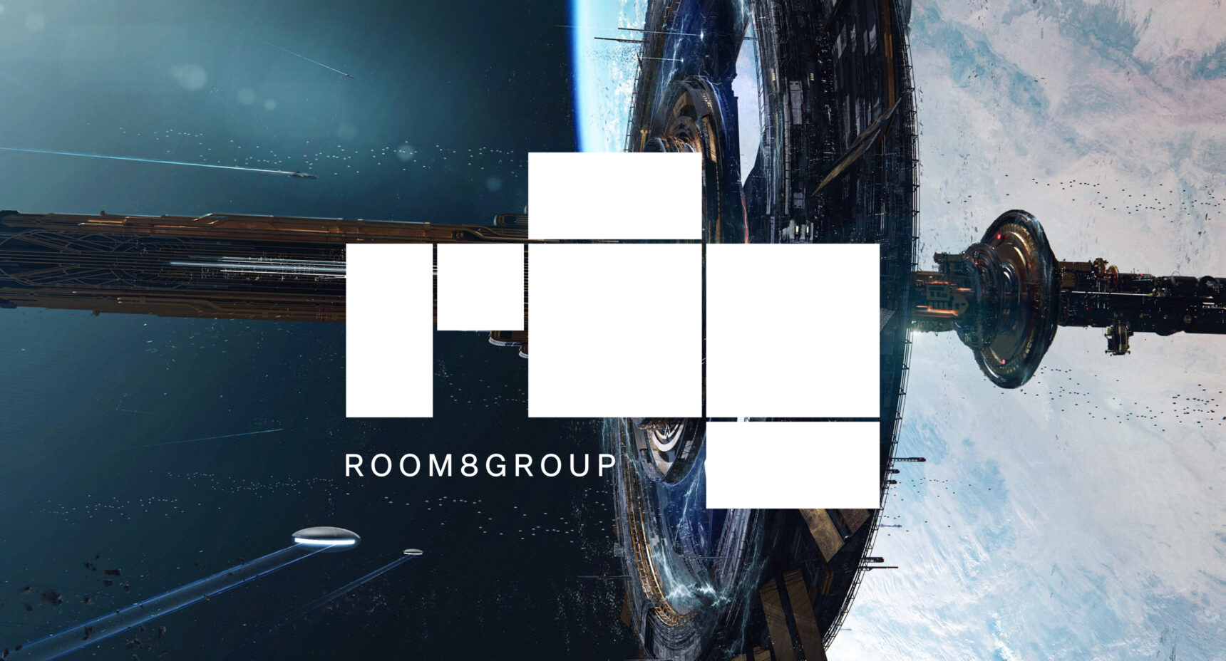
With so many studios being Room 8 Group’s “building blocks”, it was challenging to compile so many meanings in a single symbol. But we found a solution in a simple metaphor—Room 8 Group as a modular construction of brands, a collection of framing elements that constantly grows and evolves. We came up with the idea of connecting squares and rectangles, which together creates something new. This fits perfectly with our vision for the logo. Now we had to think of a way to correctly reflect this idea.

Firstly, the designers decided to use R8G, the abbreviation for Room 8 Group, as a reference. They then showed this abbreviated version in the form of geometric shapes and modules. In addition, we needed to make it easier for people who were already familiar with Room 8 Group to associate the logo and our brand. To meet this challenge, we placed a small text descriptor next to the logo.
Descriptor creation
Creating a unifying visual identifier for the brands’ logos indicating that the studio is part of Room 8 Group was a separate challenge we faced. What made it more interesting was the fact that all studio logos radically differ in style.
We needed to find a minimalistic, concise solution, neutral enough to harmonically match with any stylized studio logos, yet clear and effective in communicating the brands’ relation to Room 8 Group.
Maikl Babenko, Art Service Line Marketing Leader
The team tested different versions of the descriptor, but they stopped at the minimalist integrator “BY ROOM8GROUP.” It doesn’t clash with the studio’s logo, and blends well into various brand styles.

Coloring and visual structure
As Room 8 Group’s visual identity must remain neutral, we focused on the classic B&W palette. However, to make visual accents, we had to choose one additional color, which also had to differ from all the studios’ colors. The solution was found in lime, a popular physical marker color used to highlight texts in essays. The idea was to bring the physical experience to the digital world and evoke nostalgia.

We also needed to find fonts that could add a touch of personality without being frilly. After some discussions, our choice fell on two attractive fonts: a classic, grotesque font for primary use, and a monospaced font for specific visual accents.

The absence of the bright graphic elements in the upgraded identity leaves room for the studios’ representation. But their visuals still had to be well-structured. To regulate them, we use a grid and a classic block structure that dictate a strict hierarchy of styles and rules for using visuals in different mediums and channels: on the website, on our socials, and on career-related communications.
When we established strict rules, we introduced a unifying hierarchy into somewhat messy visuals. This is the best confirmation that invisible rules create order. Without them, there would be visible chaos.
Maikl Babenko, Art Service Line Marketing Leader
Website modernization
Updating the website of Room 8 Group was arguably the most important task throughout the entire identity creation. With the help of snig.digital, Room 8 Group team developed a redesign based on the visual identity and newly established rules.

Firstly, we wanted everything to be functional, so the logo on the main page also serves as a slider for the latest business news. Below, in a section with locations where our team operates. And in the key block with Room 8 Group service lines, we wanted to showcase the structure of the company at a high level, giving the visitors a clear view of our capacity and capabilities.
Previously, we had a News page dedicated exclusively to the company happenings. As we worked on the upgraded website, we decided not to limit ourselves and unveil our work by publishing case studies of our studios. Now you can filter them and explore the amazing works Room 8 Group brands contributed to in all their glory.

On the “Career” page, we are currently aggregating job openings from the studios’ websites. Since the Room 8 Group website is the first point of contact for most of the visitors, going forward the studios will be aggregating job openings from the Room 8 Group website, creating an interconnected system of vacancies.

Bottom Line
Our group of companies is committed to providing top-notch client service worldwide. We aim to expand and establish a global presence. The refreshed visual identity showcases the combined power of the Group’s diverse brands, emphasizing our unity. This approach aligns with our mission and enables collaboration in the development of exceptional games.
Maria Dziubina, Head of Marketing at Room 8 Group
We invite you to explore our fresh website! Discover our exciting and innovative approach to visual identity, get better acquainted with the Group, and feel free to reach out if you have a project in mind. Let’s bring it to life together.


